I'd seen swatches and read reviews of Wet N Wild's Comfort Zone 8-pan palette, and have been keeping an eye open for it around town. I finally spotted it at a Walmart superstore (that I went to just to check out the Hard Candy cosmetics at, because Walmart is evil and I always [seriously, always] go to Target instead––I think this was the 2nd time I've been to a Walmart in my life) and couldn't resist for $4.68...I wanted the greens for those very rare occasions when I want to play up the green in my eye and venture outside of neutrals, and the browns are lovely and I knew I would get a lot of use out of them. (Warning: This is really long, and very pic heavy, so if you have a slow connection, it may take awhile to load!)


Browbone: a sheer, warm ivory-cream with shimmer. This one has a rather hard texture, and the pigmentation is very sheer unless worn over primer. On the upside, this means it's a shade that can be worn by any skin tone, because the effect is very subtle and highlighting; it draws light to the browbone, but doesn't look obvious. Sometimes browbone/highlighting shades are obvious, but this one definitely isn't, and works to tie the look together and soften the edges.


And here are a few EOTD pics with the shades from the right side, used as directed by WNW; I applied these over E.L.F.'s Dawn to tone down the green-ness of it, but when worn over my nude E.L.F. primer, the colors look as they do in my arm swatches (and are therefore brighter than what I'd want to wear), and I'm wearing Essence All Eyes on Me mascara:


Wet N Wild Comfort Zone
The left side is brown-based and the right side is green-based. Both columns contain 4 shades: a light, sheer browbone shade, a more pigmented but still light eyelid shade, a buildable, darker crease color, and a dark definer shade (used for lining).

Comfort Zone in partially-cloudy light
The left side contains:Browbone: a sheer, warm ivory-cream with shimmer. This one has a rather hard texture, and the pigmentation is very sheer unless worn over primer. On the upside, this means it's a shade that can be worn by any skin tone, because the effect is very subtle and highlighting; it draws light to the browbone, but doesn't look obvious. Sometimes browbone/highlighting shades are obvious, but this one definitely isn't, and works to tie the look together and soften the edges.

in sunlight; over primer (top) and bare skin (bottom); the top swatch has a bit of the eyelid shade mixed in with it, so just look at the bottom part of it for the true color
Eyelid: a warm, coppery pink shimmer. This one has better pigmentation and texture than the browbone shade, but it's also much more vibrant over primer than alone.

in sunlight; over primer (top) and bare skin (bottom)
Crease: a warm, medium-pigmented brown. This shade isn't too dark or soft, which makes it easier to use as a crease color for me (not so much blending/toning down necessary!), and it shows up marginally better over primer than bare skin, but the pigmentation is very good either way. Unfortunately, it tends to blend out very easily and I find myself needing to layer to get it to be distinctive from the eyelid shade. On the upside, though, I don't find myself needing to be really careful with blending!

in sunlight; over primer (top) and bare skin (bottom)
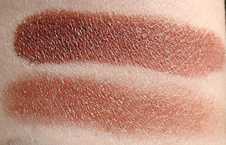
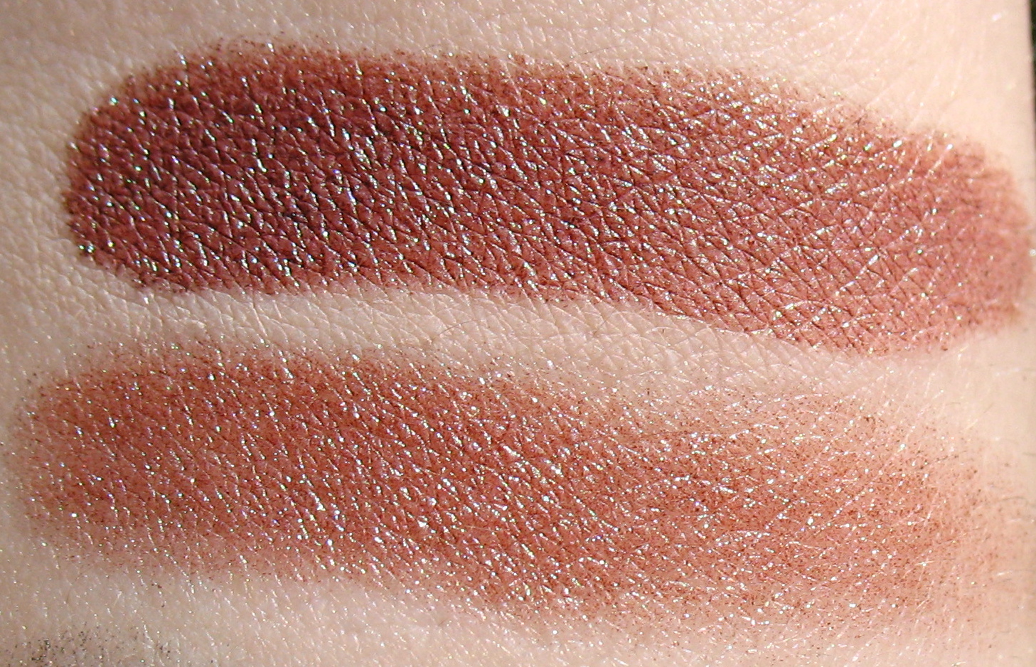
Definer: a rich, dark brown with lots of shimmer. This shade is really soft, so you pick up a lot of pigment very quickly. It's extremely pigmented whether worn alone or over primer, but the latter makes it slightly darker and cooler. I do find that it has some fallout when applied along my lashline, but using a q-tip to remove it and doing my eye makeup before the rest of my face takes care of that problem.

in sunlight; over primer (top) and bare skin (bottom); pardon the weird swoopy bottom swatch, my tremor was acting up

Left side, left to right: browbone, eyelid, crease, definer
And here's a few pics of it on my eye; I'm wearing the eyelid shade from lashline to crease, the browbone shade from crease to brow, the crease shade in my crease, and the definer shade along my upper lashes (applied with a smudge brush), all over E.L.F. nude primer with no mascara:

left (blue) eye in shade

same swatch

same swatch

same swatch, in sunlight
When worn, the eyelid and crease shades are very similar, though the crease shade adds a bit of dimension. The eyelid shade is quite pink on me, but not so much so that I feel like it gives me pinkeye. It's overall a subtle, warm neutral look, and is practically foolproof to apply. I can see myself reaching for this on days when I want to look nice, but don't want to have to try very hard.
The right side comprises:
Browbone: a pewter verging on grey with shimmer. This color is quite pigmented on its own, though more so over primer, which also makes it cooler and more true-to-pan (no skin color peeking through). Like the left side's definer shade, this shadow is quite soft, but it's a lighter shade so you don't have to worry about overdoing it too much. Interestingly, it picks up a lot of the green from the eyelid shade (below) and looks more like a grey-green when worn.

in sunlight; over primer (top) and bare skin
Eyelid: A light grass green. It's a little sheer on bare skin, but shows up nicely over primer.

in sunlight; over primer (top) and bare skin (bottom)
Crease: A blackened grey-green with sparkle. This one is just terrible on bare skin––almost no pigment, patchy and uneven, in part because the texture is very hard. Over primer, though, it works much better.

Definer: a coppery brown with teal shift. This is much more pigmented over primer than alone, and the duochrome shows up better that way, too. The pictures here don't quite do it justice; the teal is really obvious when worn, and gives a lot of dimension to the eye. I wasn't sure how it would work worn on the lashline, since red-toned shades can make you look sick, but the teal keeps it from looking icky and it actually works really well at tying the look together and adding a bit of kick.
in sunlight; over primer (top) and bare skin (bottom)

here the eyelid, crease, and definer shades are out of focus to show the shimmer; you can see the definer's teal a little better here, and the sparkle in the crease shade is really evident

Right side, left to right: browbone, eyelid, crease, definer

right (green) eye in sunlight; you can see the definer shade pretty well here, along the upper lashline

same swatch, the liner is really evident on the outer corner

right eye in shade; I can see here that I should have blended the crease shade a bit better, but considering I was blind while applying, it's not that bad

same swatch

and a bonus shot of my left (blue) eye in slightly different shade
I really like these greens; I think they go together really nicely, and I love how Dawn makes them more nude and wearable for me. It's definitely a change from my normal browns and nudes, but it's not so far outside my comfort zone (bahaha I kill myself) that I feel uncomfortable wearing it.
I also tried switching the crease and definer shades, wearing the brown-teal in the crease and the dark green along my lashes. I wore it over Dawn, though I think I could get away with wearing it over nude primer because the brown in the crease changes the feel a lot. Here it is, no mascara:

Left eye in sunlight; you can see some of the teal shimmer in the crease

Right eye in shade

Left eye in shade

Left eye in shade

Right eye in shade; you can see the red-brown and slight teal here much better, though the other pictures are more representative of what it actually looks like worn
Overview
$4.99 for 0.30 oz, available at drugstores
Quality: 8.5
Effectiveness: 5
Ease of Use: 4.75
Senses: 5
Pigmentation: 4.25
Duration: 5
Consistency: 4.5
Price: 4
Value: 5+ (8 eyeshadows for less than $5 is awesome, especially when they're all of good to great quality)
Grade: A-
I think this is really a great palette, in spite of its shortcomings. I definitely recommend wearing primer, but that's almost always the case. It may be hard to find, but it's worth keeping an eye out for if you like neutrals and greens, or if you want to try playing around with a little color without breaking the bank.
What do you think of Comfort Zone? Have you tried any of the Wet N Wild 8 pan palettes? What did you think?